# notes
---
- [[{2.2a1a1a} digital gardens are experiential text design]]
- [[{2.2a1a} the architecture and landscape of your content can hold or limit attention]]
- [[{2.2a1a1} too much navigational structure distorts your voice and makes your content feel smaller]]
# summary
---
'Hypertext Gardens' seems to be the first recorded mention of "gardening" in a digital context, per [[Appleton, Maggie - 2020 - A Brief History and Ethos of the Digital Garden]]. It's a sprawling essay about the way we experience content on the web. It's presented in nine sections, each with their own collection of [[🌲 atomic notes]] that can be navigated in several different ways; you don't always realize you're leaving one section to begin another.
Bernstein argues that [[{2.2a1a} the architecture and landscape of your content can hold or limit attention]]. Rigid architecture with strict [[{2.2a1a1} too much navigational structure distorts your voice and makes your content feel smaller|navigational structure]] (centers like menus and landmarks like your homepage) were meant to help users navigate easily, but the result is that they keep returning to the same area. This can suggest that they’re “done” with your material. It’s also boring and repetitive.
"Unplanned hypertext sprawl", on the other hand, is "wilderness"; although it's interesting, it may not be particularly inviting or user-friendly. [[virtual worlds lack natural landmarks we rely on irl]]
Gardens and parks find a happy medium. It's the "artful combination of regularity and irregularity that awakens interest and maintains attention". It allows for unexpected discoveries without the fear that you're walking into nonsense. You can direct readers through the *best* path that will enhance their experience, not necessarily the fastest.
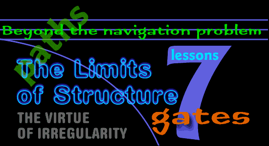
## Seven Lessons from Gardening
1. If hypertext is confusing, it's usually because of content, not because of navigation.
2. You lose traffic and distort the voice of your content with rigid navigation systems.
3. The shortest path isn't always the best.
4. Gardens are rich farmland and parks are tamed wilderness; you need both.
5. Irregularities can enhance the path through your content.
6. Use "gateways" as introductions and "guideposts" for reference to draw clear boundaries.
7. Too much structure can make your material seem smaller; complex structure makes it seem bigger since it allows for deeper and more thoughtful exploration.
# highlights
---
>Years ago, hypertext writers and researchers were concerned that hypertexts would enmesh readers in a confusing tangle of links. Early research called this the Navigation Problem... Hypertext writers and researchers alike discovered that readers weren't getting lost, that occasional disorientation was common in all kinds of serious writing, and that muddled writing was more likely to be the source of confusion than hypertextual complexity.... Navigation is not a problem. All writers need to hone transitions, to craft arguments, and to discover fresh ways to present difficult ideas. Links need not be treated as dangerous hazards; links are new opportunities for expression.
>Each time readers finish an article, the navigational apparatus returns them to a central page. Revisiting a landmark always suggests closure, prematurely inviting the reader to leave the hypertext and do something else... Important parts of web sites effectively vanish from existence as soon as they vanish from the home page.
>Rigid hypertext is streetscape and corporate office: simple, orderly, unsurprising. We may find the scale impressive, we admire the richness of materials, but we soon tire of the repetitive view. We enter to get something we need: once our task is done we are unlikely to linger. We know what to expect, and we rarely receive [anything more](http://www.eastgate.com/garden/Gardens.html).
>Today's Web designers are taught to avoid irregularity, but in a hypertext, as in a garden, it is the artful combination of regularity and irregularity that awakens interest and maintains attention.